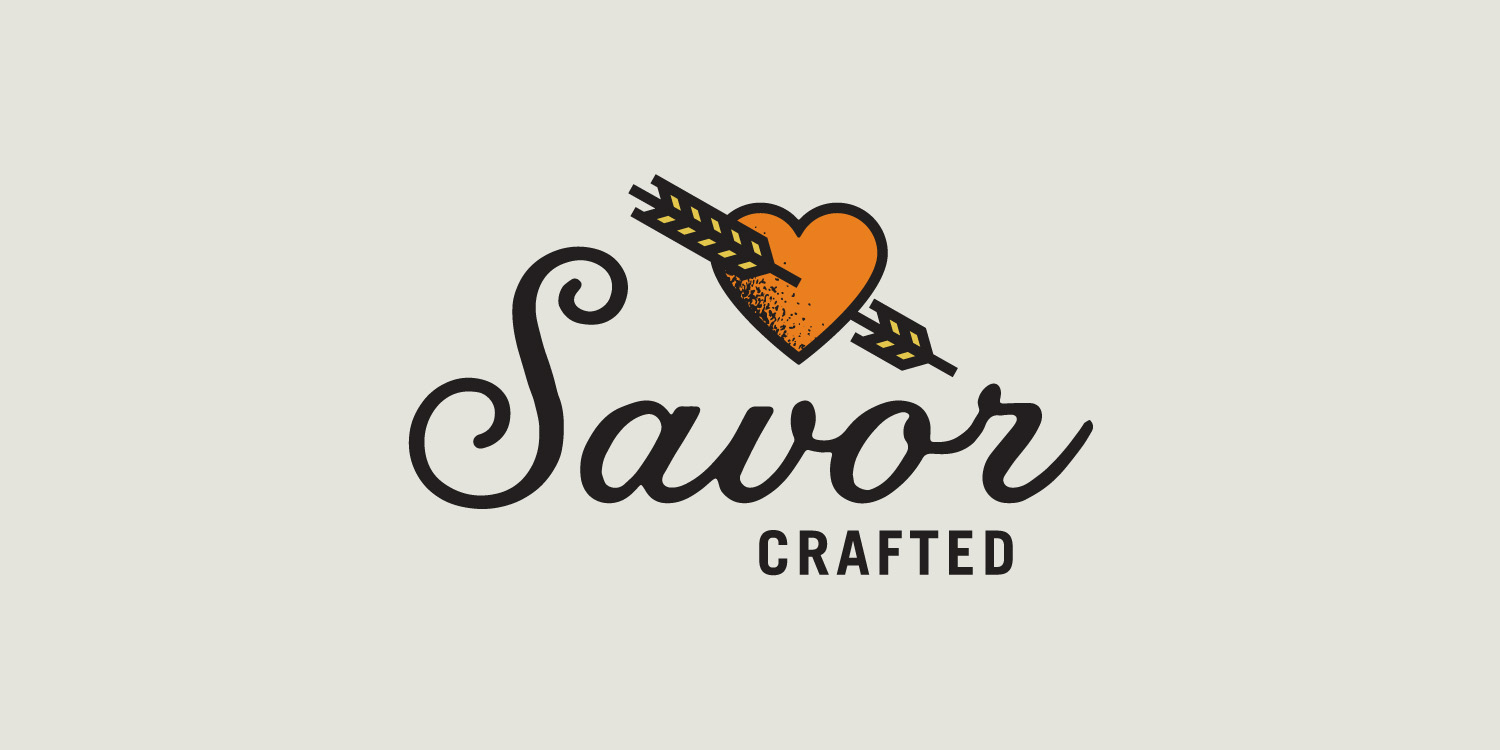
Savor is an artisanal bread company that approached Capsule to build their identity. When brainstorming and sketching I thought about the different ways the word, Savor could be interpreted. The first concept being really edgy focused on the idea of savoring and loving something so much you are willing to tattoo it onto yourself. I was inspired by the classic I heart mom tattoo and made a heart with wheat sticking through it, and paired it with a lovely Jessica Hiche font. The second concept was a bit more sweet and focused around the idea of savoring time with your family and telling stories to each other. I loved the idea of making the logo into a large drop cap like you would see in a story book.
Work done while at Capsule
CD: Brian Adducci
AD: Dan Baggenstoss
Savor Crafted


*Concept’s illustration was a placeholder from istock to convey the style to client.


